How to Graph the New Impression and Click Share Metrics to Find Data Insights in Your Google Ads Account
By Brad | 0 comments April 9, 2019
Categories
Average position is going away later this year, so it’s time to start looking towards the new metrics and how to use them to find data insights.
Some of these new numbers that we’re going to use for our insights don’t exist in the Google Ads interface, so we need to create them our self, which is fairly straight forward and we’ll walk you through the math.
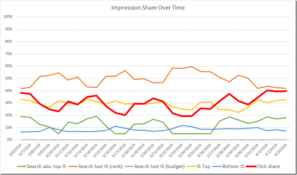
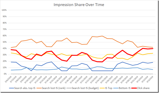
What we’re trying to get to is a graph where we can see things like this in the first chart:
- Click share correlates closely with Search Absolute Top Impression Share
- Click share is the mirror opposite of Search Lost Impression Share Rank
- etc
We’ve graphed this data out for many campaigns and accounts, and the trends are often slightly different, which is often caused by why you lose clicks (budget or rank) and the match type usage (which we’ll get into next week as some match types can mess with the trends).
Impression Share Trend or Impression Share Top Trends
There are two types of analysis we can do, and they both involve the same process- the only difference is the first step of adding the columns. The rest of the change data is the same.
Impression to Clicks Share Trending: The impression share trending examines our overall impression shares, why are losing them, and looks to see what click share is correlated to so we can gain click share.
Top Impression Share Trends: The second type of analysis involves looking at the top impression share data, along with all the impression share lost columns, to see how to gain more top impression share.
Technically, you can add this all together and make one giant chart. As there are so many columns on that chart, it is challenging to read, and you end up seeing trends that are very obvious and aren’t useful such as impression share top (rank) often mirrors (the opposite trend) impression share top when the campaign isn’t’ budget capped. Now, this is pretty obvious as if you are not budget capped; then as impression share top goes down, you have to lose impression share somewhere, so the only loss would be rank if you aren’t budget capped. As that’s not useful to see, it’s usually best to either trend just the impression share top items or the overall impression share (along with top, click share, etc.) to find insights.
As the place to start is looking at Impression to Click share trending, we’ll follow along that path. However, you can easily trend any of these metrics by just changing step 1, the columns you are exporting. The additional steps follow the same path.
Let’s walk through everything Step by Step so you can follow along.
Step 1: Add the Correct Columns
The first step is making sure you have the correct columns as all data exports involve what you see on the screen. Here are the default columns to start with for a basic impression share trend:
Note: you can also add weighted quality score as a secondary trend line instead of click share, this is interesting when looking at a lot of broad match keywords as sometimes the click share correlates closely with Quality Score in highly volatile accounts than any other trend. If you want to take this route, make sure you include Quality Score so you can weight it over time.
Step 2: The Export
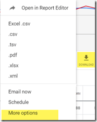
When you click the download button, make sure you choose ‘more options’:
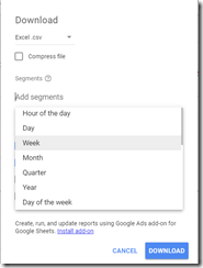
In more options, choose the time segment:
If you are looking at a single month, then you can use day segmentation. If you are looking at months of data, then it’s often useful export the data by week.
Step 3: Working with <10% & >90% in the Reports
The Excel File needs a bit of formatting to get it right for trend analysis.
The first step is dealing with any <10% and >90% numbers as you can’t do simple math with these numbers.
As you don’t know exactly if your search impression share is 0.01% or 9.99% when it’s less than 10%, we just do a simple find and replace for <10% and replace it with 5% and then do the same for >90% and replace it with 95%.
Step 4: Decide on the Chart Type
The next step is to decide on the type of chart we’re making as this will change one of the formulas in the next step.
Bar Chart
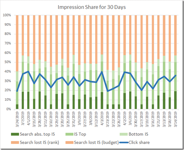
The bar chart is nice as all our numbers can add to 100% (with maybe a touch of exception for the <10% and greater than 90%). This makes it easy to see a quick comparison of why you are losing impressions and how everything stacks up against each other.
Line Chart
The line chart makes it easy to quickly compare trendlines, and it can become confusing to read if you add too many lines to it.
Once you choose your chart type, then we can start manipulating the data.
Step 4: Manipulating the Data Columns
First, you’ll need to add a new column, Bottom Impression Share. In the column, use the formula:
- Bottom Impression Share = Search Impression Share (-minus) Search Top Impression Share
Secondly, you need to decide if you want to see:
- Top impression share
- Top impressions share when you are not in position 1
For instance, in our bar chart, we want the numbers to add to 100%. If we have an absolute top impression share of 20% and a top impression share of 40%, then our chart would add up to 120% as all absolute top impression shares are also counted in the top impression share, so we’d double count the 20% absolute top impressions. In the case of the bar chart adding to 100%, you need to add another column:
- Top – Not 1 (it’s Top IS in these charts, call it whatever you want). The formula is: Top IS = Search Top IS (-minus) Search abs top IS
For the line chart, it’s up to you which you want to use. Just note that your Top IS includes your absolute top IS, so the number one position is double counted by default.
Step 5: Creating Your Charts
Lastly, select the columns you want to include in your chart and create the chart type. For these two charts we’re using:
- Stacked Bar Chart with a secondary line chart for click share
- Line chart
Other Ways You Can Create This Data
At the moment, this data can’t be created in the Report Editor or Google Data Studio as these columns aren’t included in them yet. There may be ways to make this via scripts, and the API is going to be the easiest to do this long term.
When these columns get integrated into Data Studio, we’ll make another free Data Studio report for everyone (you can claim your free Data Studio reports from here), so you can quickly graph this out by account, campaign, etc.
Analyze Your Trends
Once you have your charts created, now it’s time to start analyzing your trends. Everyone’s trend is going to be different, but here are some common ones to look for:
- Search top IS vs. Click Share
- Search abs top vs. Click Share
- Click share vs. Lost IS budget (common when there are some high search peaks during your time frame)
- Click share vs. Lost IS rank (common to see click share go up as Lost IS rank goes up when you are using a lot of true broad match; yes, that’s confusing – but it’s part of how broad match works). We’ll dig into this reason in the next week or two, so make sure to subscribe for updates
As we analyze more and more charts, we’ll start to see other trends emerge, as we’ve seen with common Quality Score trends. We’ll analyze, share, and create automated To Do items out of them so you can make sure you are seeing your data, being alerted to changes, and can find data insights in how to maximize your overall search effectiveness using the new impression share columns.






Leave a comment