How to Graph the New Top and Absolute Top Impression Rate Google Ads Metrics vs Conversions, CPA and Other Data
By Brad | 0 comments June 19, 2019
Categories
As Google Ads is sunsetting average position later this year, we’re still working through the best ways to replace this simple metric so we can pull full insights from our account.
At the moment, using absolute top and top rates are the easiest way to replace the lost piece of information. However, these metrics are frozen in time (based upon your timeframe), and we find that we get a lot more insights into examining trends.
In today’s column, we’ll look at how to trend these metrics over time so you can start pulling insights from your data.
Impression Share vs. Rate Information
First off, we want to clarify the columns we’re graphing. There are three sets of new metrics you can utilize: Impression Share, Click Share, Impression Rates.
Impression Share
Impression share looks at how often you were shown versus how often you were eligible to show. You can break this data down into:
- Impression share
- Top impression share
- Absolute top impression share
This is useful data to graph when looking at what is possible for your account and how your impression shares affect your total potential to get clicks and conversions. This article explains exactly how to create these useful impression share graphs.
Impression Rates
What this data is not useful for is replacing average position. As this is based upon what could have happened and not what actually happened, we should instead focus on the ‘rate’ numbers for looking at how often our ads were actually displayed in the top and absolute top positions.
Impression Top Rate and Impression Absolute Top Rate are the percentage of times your ads were displayed in those positions.
That means that impression share numbers are the display possibilities (how often you were shown when you could have been displayed) and impression rate numbers are the actual places where your ads were displayed.
Please note impression share is useful to add to this type of data as that gives you an overall idea of how often you were displayed. To simplify the charts, it is useful to add just impression share to the rate numbers, so you have context for how often your ads did show and then look at how often they were top or absolute top when your ads were displayed.
Click Share
The new data column, click share, is beneficial to include while looking at impression share numbers as it examines the percentage of clicks you received versus what you could have received. When graphing click share, it almost always directly mirrors impression share and impression share top. To simplify our charts, so you aren’t overwhelmed with extra data, we find this a useful column to remove when graphing out the rate data to replace average position.
The Initial Impression Percentage Graphs
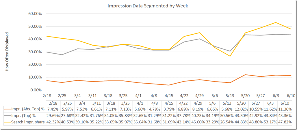
If you just wanted to replace average position over time, we can trend search impression share (how often we were displayed when it was possible to be displayed) alongside the top and absolute top impression percentages. This lets us see how often we’re being displayed in the top positions.
If you were just replacing average position, you could stop here. However, when looking at our account data, we want to trend this against another metric to see how the change in our impression rates affects various metrics.
Impression Percentage vs. Conversions
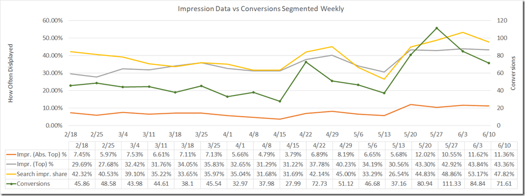
In this chart, we’ve added conversion data. Our secondary axis looks at the number of conversions we receive per week. We can see as the Search Impression Share and Impression Top % increases, our conversions follow. In this campaign, impression absolute top does not correspond that closely to conversions – it’s about being displayed (impression share) in the top (Impr (top %) positions.
Therefore, our focus should be to increase impression share and top impression share, but not bid so high we’re always in the very top position as that is a more expensive click and we’d run out of budget quicker. So just focusing on the top, but not in the absolute top position, is OK for now.
Impression Percentage vs. CPA
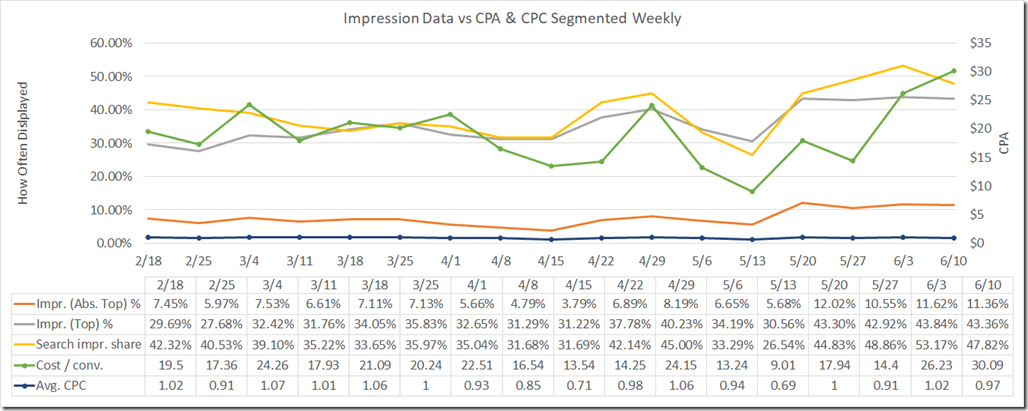
We can easily change the secondary axis to be another metric, such as cost, CPC, CPA, and so forth. In this chart, we just added CPA. The CPA is closely aligned with our impression share. In other words, as we increase our bids (CPC goes up), our impression share increases (which it should as our ad rank goes up) and our CPA also goes up, which is to be expected since our average CPC increased.
These Trends Are Not the Same for Everyone
In this account, for most of their non-brand campaigns, this is how their data trends. However, we’ve looked at campaigns where conversions are closely aligned with the impression percentage absolute top. In other words, if you aren’t in position 1, you are unlikely to get a conversion.
We’ve seen others where the impression shares near 100% and bids are very stable in the top positions. In those campaigns, just staying anywhere in the top increases conversions.
These are Easy Graphs to Create
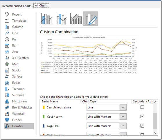
To create these graphs, just follow these steps:
- Download the data you want to trend week over week (you can do daily or monthly as well)
- Select the data you want to add to the chart
- In Excel, click on the chart button from the insert tab
- Choose custom combination.
- Put your percentage data on your primary axis
- Layer in your other data on the secondary axis
If you want to trend multiple campaigns together, you can filter the campaigns before you download the data or use labels for the campaign types and filter your data in Excel before creating these charts.
These Metrics are Not in Google Data Studio Yet
We’ve recently launched several free data studio templates:
- Free Google Ads & Google Analytics Data Studio Reports
- Free Competitive Auction Insight Analysis Data Studio Template
The new impression share and impression rate metrics are not in Google Data Studio yet. Once they become available, we’ll make some more free templates and give them away.
Wrap Up
Average position will be sunsetted in October. If you’re still preparing for the loss, this article can help you prepare for the change.
Replacing the visibility metric of average position will be the new rate metrics. How often your ad was actually displayed on top and how often it was shown in the absolute top position. These two pieces of information along with overall impression share can help you trends across your account when looking at CPA, conversions, ROAS, total revenue, and so forth.
By creating these simple charts, you can start to see how your ad’s visibility affects these other metrics. When trended over time, you can begin to develop strategies around how you want to manage bidding and visibility to ensure you are getting the most profit possible out of your Google Ads account.



Leave a comment